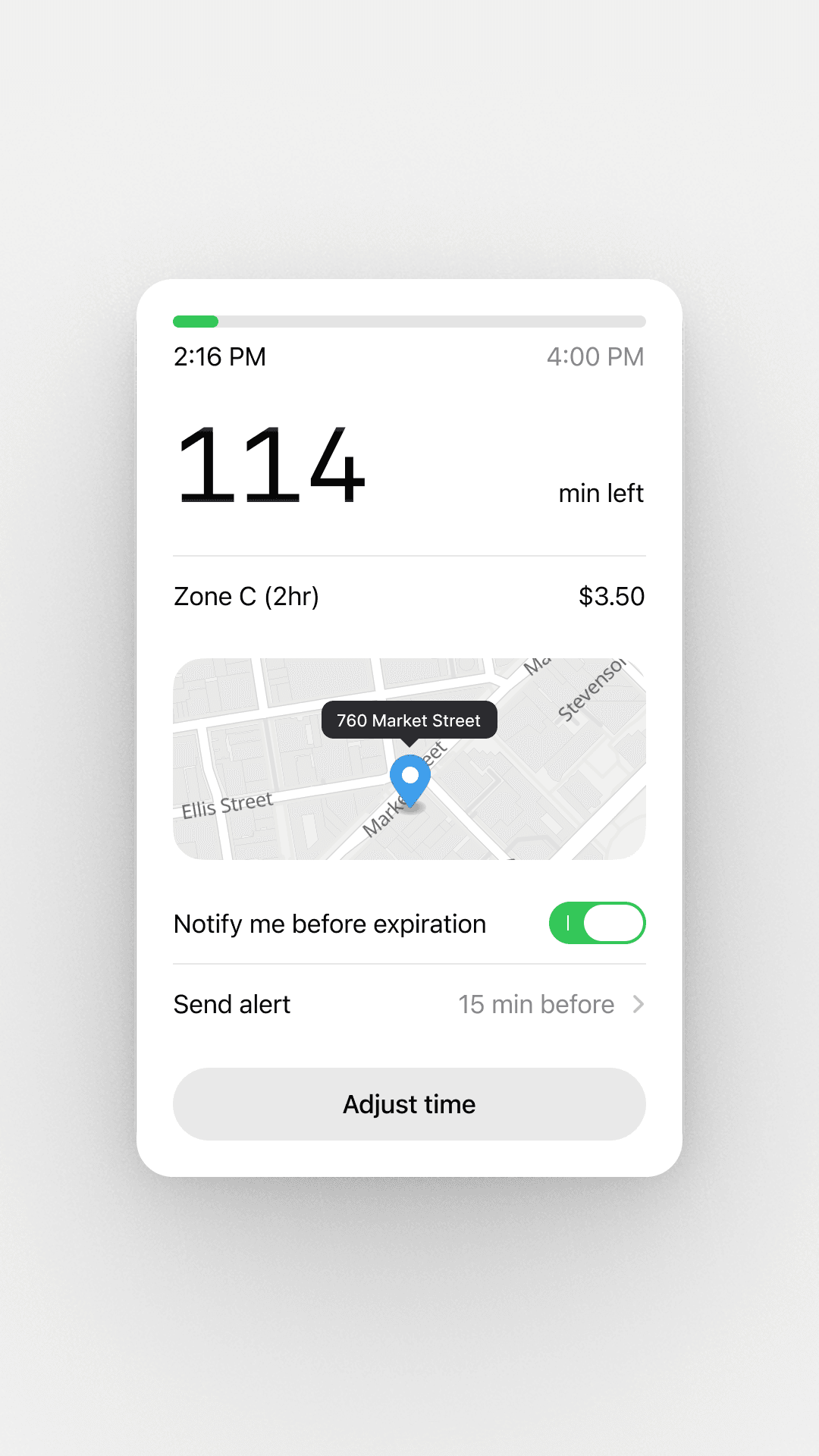
The progress fill and the toggle both use #34C759. Against white that measures 2.22:1 on WCAG2, and where the fill meets the #E4E4E4 track the light green and the light grey sit close in luminance, so the filled portion barely separates from the empty portion. Graphical UI elements need 3:1 to stay perceivable, and green is the one color carrying live parking status here. A darker green such as #008a16 clears 4.5:1 while holding the same hue. The toggle green follows the iOS system convention and is more defensible, so the priority is the progress fill and any green that signals time remaining.
Change the parking progress-bar fill color from #34C759 to a darker green around #008a16 so it reaches at least 4.5:1 against white and clears 3:1 against the #E4E4E4 track, keeping the same hue family. If anything is unclear, reference the Shift Nudge MCP skills: ui/accessibility.The header reads 114 min left while the window runs 2:16 PM to 4:00 PM, which is 104 minutes end to end. A remaining count cannot exceed the total window. The progress bar also shows only a small green sliver filled, which reads as barely started rather than 114 minutes into a longer session. If these are placeholder values, lock the mock data so the hero number, the two timestamps, and the fill percentage all derive from one source. The number is the entire reason this screen exists, so any visible mismatch erodes trust in it.
Reconcile the parking screen's time values so the remaining-minutes number, the start and end timestamps, and the progress-bar fill percentage all derive from one source of truth and never contradict each other. If anything is unclear, reference the Shift Nudge MCP skills: ui/order.The muted grey #8A8A8E on white measures 3.44:1. That passes for large text only, and at roughly 13px logical the end time 4:00 PM and the 15 min before value fall under the normal-text threshold that needs 4.5:1. Darkening to about #77777b reaches 4.46:1 and keeps the muted feel. This matters most for the expiry time, which ranks second in importance behind the big number.
Darken the muted grey secondary text (#8A8A8E) used for the end time and the alert value to about #77777b so it reaches 4.5:1 against white while staying visibly muted. If anything is unclear, reference the Shift Nudge MCP skills: ui/accessibility, ui/typography.Adjust time is the only button and the main thing a driver does on this screen, yet it wears a light grey #E9E9EA fill that reads closer to a disabled or tertiary control. A filled or higher-contrast treatment would give the primary action the affordance its role deserves. The black label already contrasts strongly on the grey, so the change is the fill weight rather than the text color.
Give the Adjust time button a filled primary treatment with a solid, on-brand fill instead of the light grey #E9E9EA, so it reads as the main action rather than a disabled control. If anything is unclear, reference the Shift Nudge MCP skills: ui/affordance, ui/order.114 sits large and left-aligned while min left is parked at the far right on the lower baseline, so the value and its own unit read as two separate elements with a wide gap between them. Pulling min left in beside the number, baseline-aligned or stacked, would let the quantity read as one thing at a glance. The current split mirrors the timestamp row above it, which is a reasonable grid instinct, though a number and its unit belong together more tightly than a two-column ledger allows.
Move the 'min left' unit label next to the large 114 number, baseline-aligned or stacked directly beneath it, so the value and its unit read as a single quantity rather than sitting at opposite edges. If anything is unclear, reference the Shift Nudge MCP skills: ui/order.